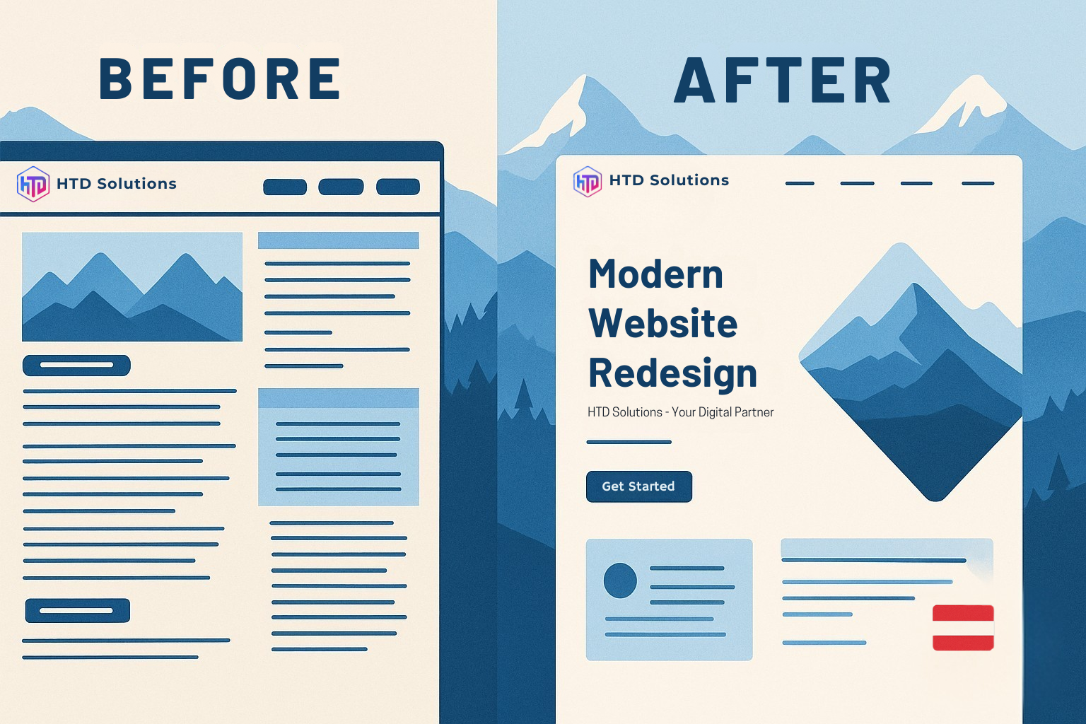
When companies start redesigning their website or app, one question appears again and again:
What's the difference between UI and UX — and why should we care?
Understanding this distinction isn't just design trivia — it determines how well your digital product performs, converts, and communicates your brand.
Table of Contents
Quick Answer
UI (User Interface)
What users see — colors, buttons, layouts, visual design elements.
UI (User Interface)
What users see — colors, buttons, layouts, visual design elements.
UX (User Experience)
What users feel — how easy, logical, and satisfying it is to use.
UX (User Experience)
What users feel — how easy, logical, and satisfying it is to use.
How They Work Together
UI creates first impressions and trust, UX ensures people can actually accomplish their goals.
How They Work Together
UI creates first impressions and trust, UX ensures people can actually accomplish their goals.
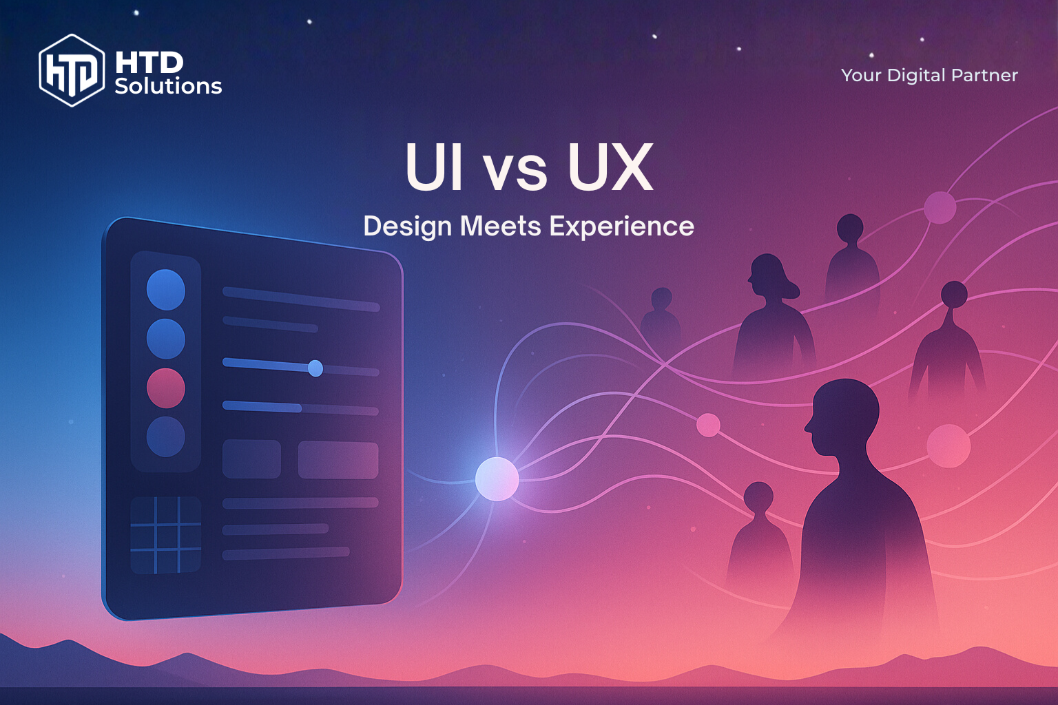
UI is what users see (colors, buttons, layouts), UX is what they feel (ease, logic, satisfaction). Great UI attracts attention, great UX keeps users engaged and converting. You need both—beautiful design that's also intuitive. Invest in UX research first, then polish the UI. Poor UX kills conversions even with stunning visuals.
UI and UX in Simple Terms
Think of UI and UX like a car: UI is what you see and touch (the dashboard, steering wheel, buttons), while UX is how it feels to drive (smooth acceleration, intuitive controls, comfortable ride).
| Aspect | UI (User Interface) | UX (User Experience) |
|---|---|---|
| Definition | What users see → colours, layout, typography | What users feel → flow, clarity, functionality |
| Focus | Visual design and interface elements | User journey and overall experience |
| Goal | Make it look good and consistent | Make it work well and intuitively |
| Tools | Design systems, style guides, visual mockups | User research, wireframes, prototypes, testing |
Key takeaway: One cannot work without the other. Beautiful UI with poor UX frustrates users. Great UX with weak UI fails to build trust.
How They Work Together
First Impressions (UI)
Users form opinions about your credibility within milliseconds. Consistent colors, typography, and layout create immediate trust and professional perception.
Long-term Satisfaction (UX)
After the first impression, users need to actually accomplish their goals. Intuitive navigation, clear information hierarchy, and smooth workflows determine whether they'll return.
When done right: Good design becomes invisible. Users don't notice the interface — they just focus on their goals and feel confident using your product.
Real-World UI/UX Examples
When Design Meets Reality
The best way to understand UI/UX is to see it in action. Let's examine how design principles apply beyond the screen — and what this means for your digital products.
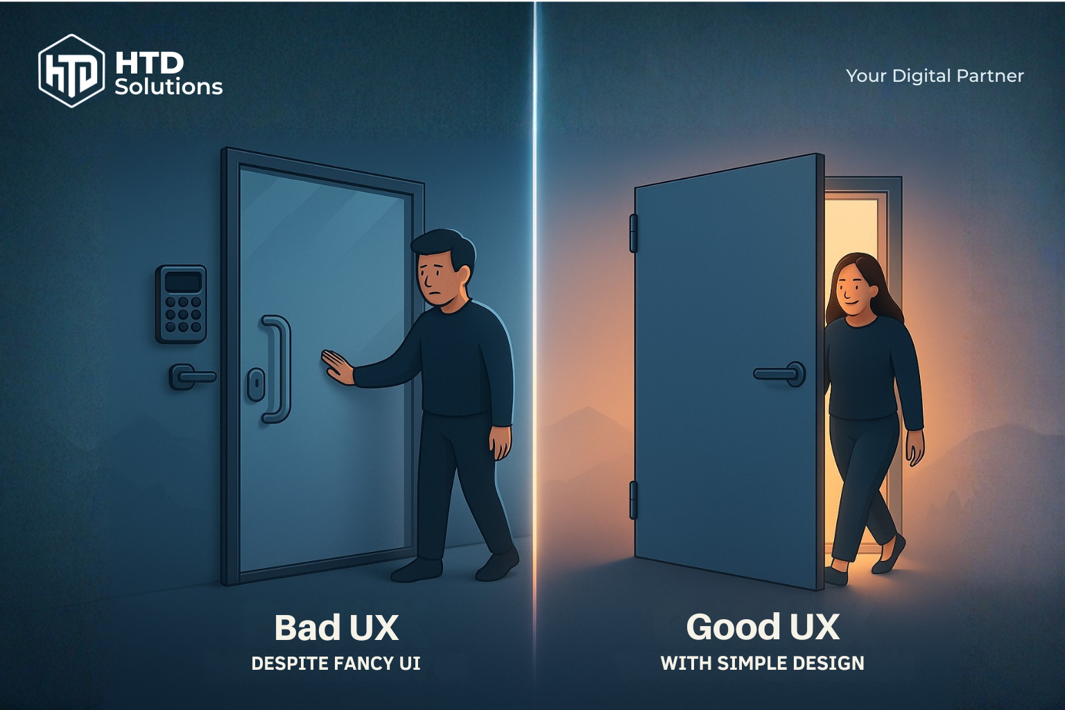
Bad UX vs Good UX: Left shows over-complicated door with keypad and confusing handles, right shows simple, intuitive design
🚪 Over-Complexity vs Simplicity: When More Features Create Worse Experience
The Perfect Contrast: The image shows the ultimate UX dilemma — on the left, a confused person facing an overly fancy glass door with keypad, multiple handles in weird positions, and complex high-tech features. On the right, someone effortlessly using a simple, basic door with a standard handle. The fancy door looks impressive but fails at its core purpose.
❌ Bad UX Despite Fancy Aesthetics (Left)
- • Sleek glass design with premium materials
- • High-tech keypad and multiple security features
- • Handles positioned in confusing locations
- • User stands there puzzled despite impressive visuals
- • Beautiful but completely unusable
✅ Great UX with Simple Design (Right)
- • Basic materials but perfect functionality
- • Standard door handle in expected position
- • No cognitive load or decision paralysis
- • User immediately knows what to do
- • Usability trumps fancy aesthetics every time
Digital Lesson: Your website should be like the simple door — users should never have to think about how to use it. Fancy visuals and premium features mean nothing if users can't accomplish their goals. Usability always beats aesthetics in the long run.
🛒 E-commerce Checkout: The €1M Design Decision
A large retailer increased revenue by 45% with one simple change: replacing "Register" with "Continue as Guest" on their checkout page.
❌ UI-Only Approach
- • Beautiful, branded registration form
- • Consistent visual design
- • Clear typography and colors
- • But... 23% cart abandonment
✅ UX-Focused Solution
- • Guest checkout option prominent
- • Registration optional, after purchase
- • Reduced friction in buying process
- • Result: 45% revenue increase
📱 Banking App: Trust Through Micro-Interactions
A European bank redesigned their mobile app and saw customer satisfaction increase by 67% and support calls decrease by 40%.
🎨 UI Improvements
- • Consistent color coding for account types
- • Clear visual hierarchy for transactions
- • Accessible font sizes and contrast
- • Professional, trustworthy aesthetic
⚡ UX Enhancements
- • Transaction confirmation animations
- • Biometric login reduces steps from 5 to 1
- • Smart search finds transactions instantly
- • Error prevention (not just error messages)
Key Insight: In financial services, every interaction must build confidence. UI creates trust at first glance; UX maintains it through every transaction.
🏢 Austrian SME Success Story
A Viennese consulting firm improved their lead generation by 180% after redesigning their service inquiry process.
❌ Before (Design-Heavy)
- • Stunning hero video and animations
- • Complex multi-step contact form
- • Technical jargon throughout
- • 2.3% conversion rate
✅ After (User-Centered)
- • Clear value propositions upfront
- • Simple 3-field contact form
- • Industry-specific landing pages
- • 6.4% conversion rate
Business Impact: Sometimes less visual complexity leads to more business results. The goal is conversions, not awards.
🎯 The Universal Design Lesson
Whether it's a door, a checkout process, or a mobile app — the best design solutions are invisible to users. They accomplish their goals effortlessly and feel smart doing it. That's the mark of UI and UX working in perfect harmony.
Why It Matters for Business
Conversion & Revenue
UX removes friction in the buying process, while UI builds the visual trust that encourages users to convert.
Conversion & Revenue
UX removes friction in the buying process, while UI builds the visual trust that encourages users to convert.
Brand Perception
Visual consistency across all touchpoints creates credibility and professional perception.
Brand Perception
Visual consistency across all touchpoints creates credibility and professional perception.
Efficiency & Support
Good UX design reduces user errors and support tickets, saving time and resources.
Efficiency & Support
Good UX design reduces user errors and support tickets, saving time and resources.
Employee Experience
Internal dashboards and tools deserve the same design care to boost productivity.
Employee Experience
Internal dashboards and tools deserve the same design care to boost productivity.
Signs Your Business Needs a UI/UX Upgrade
Is your website or app holding back your business? Here are the warning signs that indicate it's time for a UX overhaul:
Inconsistent Visual Design
Different colors, fonts, and layouts across pages and platforms make your brand look unprofessional and confuse users.
Inconsistent Visual Design
Different colors, fonts, and layouts across pages and platforms make your brand look unprofessional and confuse users.
Lost & Confused Users
When users can't find what they're looking for or don't understand your navigation, they leave — often to your competitors.
Lost & Confused Users
When users can't find what they're looking for or don't understand your navigation, they leave — often to your competitors.
High Bounce Rates
Visitors leaving immediately from key landing pages signals that your design isn't connecting with their needs or expectations.
High Bounce Rates
Visitors leaving immediately from key landing pages signals that your design isn't connecting with their needs or expectations.
Frequent Support Requests
When users repeatedly ask how to use basic features, it's not a training problem — it's a design problem.
Frequent Support Requests
When users repeatedly ask how to use basic features, it's not a training problem — it's a design problem.
Poor Mobile Experience
If your mobile experience feels like an afterthought compared to desktop, you're losing 60%+ of your potential customers.
Poor Mobile Experience
If your mobile experience feels like an afterthought compared to desktop, you're losing 60%+ of your potential customers.
Mysterious Conversion Drop-offs
Users start your conversion process but abandon it for no clear reason — usually due to hidden UX friction points.
Mysterious Conversion Drop-offs
Users start your conversion process but abandon it for no clear reason — usually due to hidden UX friction points.
Sound familiar?
Even one of these signs can indicate significant revenue loss. The good news: most UI/UX problems have clear, measurable solutions. A strategic redesign typically pays for itself within 3-6 months through improved conversions and reduced support costs.
Sound familiar?
Even one of these signs can indicate significant revenue loss. The good news: most UI/UX problems have clear, measurable solutions. A strategic redesign typically pays for itself within 3-6 months through improved conversions and reduced support costs.
How HTD Solutions Fixes Your UI/UX Problems
No guesswork, no endless revisions, no "design by committee." Here's exactly how we turn your UI/UX problems into business results:
We Find Out What's Really Broken
User interviews, analytics deep-dive, and competitor analysis to identify exactly where you're losing customers and revenue. No assumptions — just data.
We Find Out What's Really Broken
User interviews, analytics deep-dive, and competitor analysis to identify exactly where you're losing customers and revenue. No assumptions — just data.
We Build a Logical Structure
Reorganize your content and features so users can find what they need instantly. Think of it as renovating your digital house — but smarter.
We Build a Logical Structure
Reorganize your content and features so users can find what they need instantly. Think of it as renovating your digital house — but smarter.
We Create Your Visual Identity System
Consistent colors, typography, and components that make your brand instantly recognizable and trustworthy across every touchpoint.
We Create Your Visual Identity System
Consistent colors, typography, and components that make your brand instantly recognizable and trustworthy across every touchpoint.
We Test Everything Before Launch
Interactive prototypes tested with real users. We fix problems before they cost you customers, not after.
We Test Everything Before Launch
Interactive prototypes tested with real users. We fix problems before they cost you customers, not after.
We Keep Improving Your Results
Continuous optimization based on real user behavior and performance data. Your ROI keeps growing over time.
We Keep Improving Your Results
Continuous optimization based on real user behavior and performance data. Your ROI keeps growing over time.
"Every project is different, so we always start with understanding your specific challenges and business goals before proposing solutions."
The Bottom Line
UI and UX aren't just about making things look nice — they're about making your business more successful. When users can easily find what they need and trust your brand visually, they convert more, complain less, and recommend you to others.
UI + UX = Better business outcomes, not just nicer visuals.
(FAQs) Frequently Asked Questions
Ready to Transform Your Digital Experience?
Don't let poor design drive customers away. Let HTD Solutions help you create interfaces that users love and experiences that convert.