If your brand looks different on every slide, quote, and social post, that's not "creative"—it's costly. This guide shows Austrian SMEs how to go from messy brand to a usable style guide in seven days. Clear decisions, simple rules, and templates your team will actually follow.
Brand inconsistency wastes hours on rework and erodes trust. A lightweight style guide fixes this in one focused week.
Speed up production and raise perceived quality with a system your team will actually use.
Table of Contents
Quick Answer
The fix
Set a few non-negotiables: logo usage, color, typography, spacing, and UI tokens. Ship a 12–20 page PDF with templates in one week.
The fix
Set a few non-negotiables: logo usage, color, typography, spacing, and UI tokens. Ship a 12–20 page PDF with templates in one week.
Why it matters
Brand consistency raises perceived quality, speeds production, and improves readability—especially on mobile and accessible contexts.
Why it matters
Brand consistency raises perceived quality, speeds production, and improves readability—especially on mobile and accessible contexts.
What you'll deliver
Logo pack, color tokens (HEX/RGB/CMYK), type scale, spacing guide, imagery rules, voice examples, and slide/doc templates.
What you'll deliver
Logo pack, color tokens (HEX/RGB/CMYK), type scale, spacing guide, imagery rules, voice examples, and slide/doc templates.
A compact style guide takes 7 days: logo rules, colors with WCAG contrasts, type scale, image examples, UI tokens. It costs 40–60 hours but saves months of rework and strengthens your brand immediately.
The problem most SMEs face
- • Different logos, random fonts, clashing colors, slides that look homemade.
- • Time lost arguing about "small" design choices; sales decks rebuilt from scratch.
- • Inconsistent UI erodes trust and hurts readability, especially on mobile.
A lightweight style guide fixes this by setting a few non-negotiables: logo usage, color, typography, spacing, and UI tokens. That's enough to raise perceived quality and speed up production.
For digital: Use accessibility contrast thresholds so text remains legible across devices.
What your style guide must include
2.1 Logo
- Primary, reversed, monochrome versions
- Minimum size, clear-space, and "do not" examples
- File delivery: SVG (digital), PDF/EPS (print), PNG (raster)
2.2 Color
- Primary and secondary palettes with HEX/RGB/CMYK
- Contrast rules: normal body text must meet WCAG AA 4.5:1; large text 3:1
- This preserves readability and legal compliance across many contexts
2.3 Typography
- Heading and body families with fallbacks
- Sizes/line-height for desktop and mobile
- Line length guidance: target 50–75 characters per line to improve reading speed and comprehension in typical body text
2.4 Imagery & iconography
- Example photo treatments (warm vs. cold, people vs. product), do/don't
- Icon set rules (stroke/filled, corner radius, sizes)
2.5 Voice & tone (one page)
- How we write: short sentences, active verbs, banned buzzwords
- Examples for site, email, proposal
A 7-day plan to ship your style guide
Audit & choose
Gather real materials (website, pitch, invoice, LinkedIn). Decide on a primary logo and two brand colors.
Color proofing
Expand palette, check contrast on common backgrounds (white, brand, dark). Record tokens.
Typography
Pick heading/body families, size scale, and line-height; test on web/mobile with line-length guidance.
Logo rules
Minimum size, clear space, misuse examples, and export all files.
Imagery & tone
12 example images and a one-page writing guide.
UI tokens & components
Buttons, inputs, cards; compile tokens in a simple table your devs can copy.
Package & publish
Export a 12–20 page PDF + a zip with logos, fonts (or links), token JSON, and a one-page "styleguide vorlage" your team can duplicate.
Two mini cases (Austria)
Case A — B2B service (20 staff)
Problem: five different blues and inconsistent slides.
Action: fixed two-tier palette, standard H1–H6, tokenized buttons/links.
Result: proposal assembly time dropped by ~30%; sales team reports higher reply rates to standardized decks.
Case B — Specialty retail (3 stores + ecommerce)
Problem: social posts looked off-brand; product images mismatched.
Action: one-page voice guide, photo treatment rules, and preset templates.
Result: social throughput +40% and fewer reworks from marketing agency.
Checklist (one page)
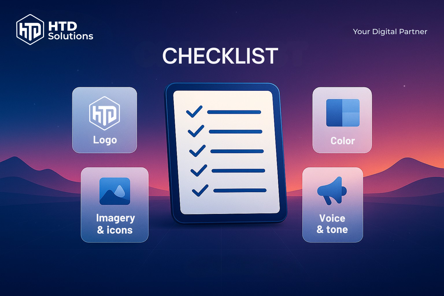
- Logo: variants, clear space, minimum size, misuse.
- Color: HEX/RGB/CMYK; contrast checks; light/dark usage.
- Type: families, weights, sizes, line-height, 50–75 CPL note.
- Layout & spacing: grid, spacing scale (4/8-point).
- Imagery & icons: rules and examples.
- Voice & tone: three example rewrites.
- UI tokens: color/text/space/radius/shadow/typography.
- Deliverables: PDF guide, token JSON, logo pack, slide/Doc templates.
Sources
- • WCAG contrast ratios (AA): 4.5:1 for normal text, 3:1 for large text. W3C WCAG Guidelines
- • Style guides vs. design systems; brand style guide scope. Nielsen Norman Group
- • Design tokens concept and format (DTCG); usage in popular systems. W3C Design Tokens Community
- • Material typography guidance and tokenized type scales. Material Design 3
- • Readability and line length ranges (50–75 CPL). Baymard Institute
- • Austrian pricing context: designaustria guidance and local price pages. Design Austria
(FAQs) Frequently Asked Questions
Want a 7-day Brand Sprint?
Get a usable styleguide vorlage, tokens, and templates that your team will actually follow. Clear decisions in one week.